Ever since the earliest human beings created charcoal and red ochre paintings deep in caves, every culture has used color in the forms of pigments and paints to bring to life their dreams, their environment and their experiences1. Among Indigenous people of the Northwest Coast the application of mineral pigments to objects and to their own bodies has been one of the most enduring expressions of creativity, spirituality, and identity throughout millennia, and it still is today. Prior to trade with Europeans people of the Northwest Coast relied entirely on their environment for pigments and paints from a variety of sources, including colored earths, stones, burnt materials, and organic binders.
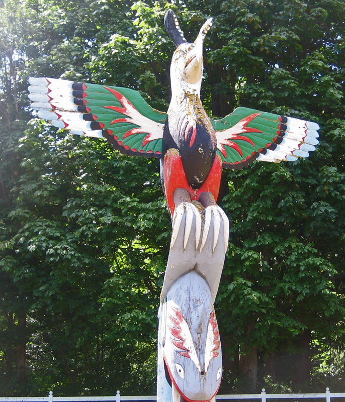
Detail of paint on Bronson Pole.
In the twentieth century Lummi carver Joe Hillaire and other carvers had a wide variety of oil-based paints to choose from to paint their totem and story poles. Until the 1960’s the only commercial paints available were oil based paints. Linseed oil was the favorite oil among several which included walnut, poppy, castor and hempseed, as a binder for mineral pigments. Locally, Dutch Boy Paints, which were then a linseed oil-based paint, were available and were the most popular brand.7 In the 1960’s acrylic paints were developed and quickly became popular because of their quick drying and ease of cleanup with water. The time it took and the conditions necessary for oil-based paint to dry properly was a painstaking process that was alleviated by the new paints. Given the timing of acrylic-based paint becoming available to the public, it is obvious Joe Hillaire’s poles painted in the 1950’s were painted with oil-based paints. It is clear from visual examination that those painted in the 1960s were painted with acrylic paints.
Today an artist can go to the local artist’s supply shop or hardware store and choose from thousands of colors or even have a color mixed. For totem pole carvers it is especially convenient because they can obtain large amounts, from pints to five gallon buckets, of any color they need.
Close examination of the Schelengen Pole, the Centennial Pole and Land in the Sky Pole shows they have been painted at least twice, and in the case of the Centennial Pole, possibly as many as four times. Land in the Sky shows evidence of being painted three times (there are three layers of paint clearly visible) in various areas. When the carving of Land in the Sky was finished, Joe Hillaire and his daughter Pauline agreed it should not be painted in order to allow chiaroscuro (the natural play of shadow and light) and the beauty of the wood to enliven the pole. Sometime after it was moved to Suquamish, Land in the Sky was painted using bold colors, similar to those used on the Centennial Pole ten years earlier. Later in its life Land in the Sky was again painted, using flat, muted colors and pastels. Large parts of the pole, which the previous paint job had left as natural wood, were painted pale blue or white and the pole was now covered entirely with paint. The most recent paint is badly weathered, flaking away to reveal large areas of weathered and rotted wood and the earliest colors: rusty orange, scarlet, deep blue and vivid blue-green. These original colors can also be seen in photographs of the Schelengen Pole when it was first erected. It too has been over-painted with pastel colors, including pink, which has never been an acceptable color on the Coast Salish palette.
Joe Hillaire normally chose bold, bright colors to bring the viewer’s attention to the various characters and elements on his poles. He thoughtfully chose colors that would enhance aspects of the story the pole is telling. At this time the only poles that bear colors that match closely those that Joe originally chose are the Centennial Pole and the Kobe Pole. When the Centennial Pole was recently restored, a great deal of detailed cleaning, examination, and thoughtful analysis was done to determine what the original colors were. With each over-painting of the Centennial Pole the original color scheme was changed with no regard to the original colors. The most recent restoration team of carvers for the Centennial Pole, Felix Solomon and Scott Jensen, and conservator, Andrew Todd, found archival photographs, and after digging through and stripping off layers of old paint, were able to match closely the original colors Joe Hillaire used.
Joe knew that the use of red (or another bright color) as an accent can help the eye of the viewer immediately focus attention on a particular element. A small bit of red can help focus the viewer’s eye on particular features, such as the use of a red accent line around an eye to draw attention, as Joe did with the eyes of the bear on his Man in Transition totem pole. Joe also used a little red in the nostrils and just a bit of red in the bear’s mouth. The red is faded now, but when fresh, it would have been a distinct draw for the eye of the viewer. Even the smallest red spots and the thinnest of red lines help us focus, not just on the features bearing red (in fact, most people do not even realize they are seeing the red) but on the entire design, by immediately orienting the viewer’s perception of many features into a single cohesive picture. Red triangles beside the face of the Bear Dancer on the Centennial Pole serve as visual signals to draw our attention to, and to accent, the dancer’s face. The yellow details on the Wolf Dancer’s regalia quickly inform us that his body is in motion, highlighting the positioning of his body in mid-dance. The Flea in red and yellow stands out against the dark background, instantly signaling he is a very deliberate and integral character in this story.
The Man in Transition Pole is an aesthetically and visually interesting work that differs from Joe Hillaire’s other totem poles both in the carving and the painting. The paint job is understated and subtle, letting the carving take precedence. The black paint outlining the eye sockets and mouth, covering the cheeks and running up into the spear headdress, help emphasize the facial characteristics of this man who has struggled through the transformation from beast to human, from boy to man. The torso of the man is weathered bare wood, but the lower half of his body is carved to look like bear fur and painted black to reinforce this look. The green of the serpents and around the headdress spears is a simple contrast to the dark wood and black paint. The Eagle is also painted simply with a black background on which simple circles embellish the wings and chest. The Eagle’s feet and head are painted naturally; the head white and the feet yellow. Of all Joe Hillaire’s poles, this is the least colorful and has the least paint. Yet it tells a powerful, archetypal story which is easily read and meaningful in any culture.
Joe Hillaire used color to emphasize the characters and creatures on his poles, bringing them to life and bringing oral tradition to visual life. Using colors to help tell the story, Joe chose colors that complemented one another; he chose colors deliberately, thoughtfully, and with a sense of tradition and artistry to bring his visions and stories to life for thousands of viewers. Joe, like his ancestors, used color to bring visual life to traditional stories and characters, and to bring life to stories relevant to cultural, social and political issues of his day.
Notes
1. There is no evidence that vegetable matter was used as pigment for paints. Vegetable matter was used for dyes (for wool and hides) and for staining objects (horn, wood, leather). Most colors obtained from vegetation, when set (made stable by a mordant such as urine) are long-lived in wool for weavings, but are transparent and fugitive (fade with time) on wood and leather.
2. Moffat, E.A., P.J. Sirois. “Occurrences of Green Earth Pigment on Northwest Coast First Nations Painted Objects.” Archeometry 50(2008)17.
3. Wainwright,I.N.M., K. Helwig, D.S. Rolandi, C.A. Aschero, C. Gradin, M.M. Podesta, M. Onetto, C. Bellelli. “Identification of Pigments from Rock Painting Sites in Argentina.” L’art Avant L’histoire: La conservation de l’ art prehistorique, 15-24, 10es journees d’etudes de la Section francaise de l’institut internationale de conservation, Paris (2002)23-24.
4. Goodall, R.A., J. Hall, R. Viel, F.R. Agurcia, H.G.M. Edwards, P.M. Fredericks. “Raman Microscopic Investigation of Paint Samples from the Rosalita Building, Copan, Honduras”. Journal of Raman Spectroscopy, (2003): 37, 1072-?77.
5. Mayer, Ralph. A Dictionary of Art Terms and Techniques. New York: Harper & Row, 1981.
6. Ancheta, Melonie. Pre-trade Pigments of Northwest Coast Natives. Research in progress.
7. Peterson, Terry. Interview by author. Bellingham, WA, September 16, 2011.
